
As a software developer, you’ll understand the importance of having a clear overview of your projects, tracking development progress and product performance, and quickly identifying and correcting negative trends. With so many features being created and modified in each project, and so much information flying around in the process, it can be a challenge to consolidate data and effectively communicate key performance indicators (KPIs).
That’s where communication tools such as real-time dashboards come in handy. They help you monitor your product development process and performance, and aggregate data to effectively communicate key insights to all stakeholders involved. They also help you manage your workload and stay on top of multiple projects at once by consolidating all the immediate information you need, in one single screen. Sounds good right? Read on for a comprehensive introduction to the world of live software engineering dashboards!
What is a dashboard?
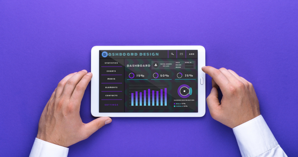
A dashboard is an information management and communication tool. Much like the traditional car dashboard that bore the term, dashboards consolidate and organize the most relevant data from multiple sources into a clear, visual format, understandable at a glimpse. They allow both businesses and individuals to monitor performance by tracking KPIs, actionable data, and intelligence in real-time.
How can dashboards be of use to software developers?
For software developers, visual dashboards are a useful tool to create development plans, monitoring daily work activity, tracking projects, and measuring KPIs. Software engineering dashboards monitor known areas of interest or goals and aggregate real-time data in a simple, interactive, and dynamic way. By automatically consolidating key information, they save you time and provide insights into your processes and performance. This, in turn, can help you and your team make strategic, data-driven decisions.
As a remote worker, it is important to find ways to consolidate your project development and product performance in a professional and easy-to-understand format. Dashboards use data visualizations, such as tables, line charts, and bar charts, to simplify the transmission of complex data. For example, coding velocity, cycle and lead times, the average time to repair systems, bottlenecks, and how you spend your coding time, whether coding, debugging, or testing.
Different types of dashboards:
When it comes to software engineering, dashboards support operational, strategic, and analytical tasks.
Operational dashboards are designed to be integrated into your daily workflow. They provide a comprehensive snapshot of your immediate individual or team performance by tracking key metrics and KPIs, such as up and down times, errors, response times, and more. They can also be used by software developers to monitor and display real-time data of live projects that may require quick responses. By identifying issues as they occur and alerting you to the problem, they enable you and your team to act immediately and stay on top of multiple projects all at once.
Strategic dashboards focus on long-term strategies and high-level metrics. This dashboard type is often used by the decision-makers of a business because they provide a quick overview of KPIs and forecasts. Unlike operational dashboards that update on a real-time basis, strategic dashboards usually take a retrospective approach. They summarize data over longer periods - monthly, quarterly, or yearly - taking past benchmark performance data and comparing it to the current moment. As a remote software engineer, this dashboard type can help you obtain an overview of your overall progress and performance and help you set strategic goals to achieve your KPI targets.
Analytical dashboards scrutinize large volumes of data. Unlike other dashboards that summarize data to be understood at a glance, this dashboard type is highly interactive and allows you to drill down into detailed analyses of metrics and reports. Analytical dashboards provide increased visibility into your key processes and metrics over time, to help you analyze long-time trends, discover insights and predict outcomes.

Live dashboard best practices:
When building and designing a dashboard, it is useful to think about your goals, what you want to communicate, and who your audience is. Remember, dashboards are communication tools. So, an effective dashboard communicates key actionable data. The best dashboard designs are built with both yourself and your audience in mind, whether that’s a colleague, senior director, or client.
To help you lay the foundation for a successful dashboard, here are some best practices and dashboard tools to look out for:
- Identify your KPIs
- Optimize UI and UX
- Group related metrics
- Round all numbers
- Have a consistent design
- Use drill up, drill down, and filtering
- Create a well-defined set of goals
- Collaboration and sharing options
- Use size and position to show the hierarchy
- Implement data visualization objectives
- Present only the most relevant and essential data
- Give your numbers context by using clear labels

Ready to give it a go? Check out our top picks of dashboard application software:
Tableau is considered a leading data visualization and data analysis software. The platform has been commended for its intuitive and easy-to-use interface, professional visualization capabilities, and wide range of data connectivity that it supports.
Similarly, Microsoft’s business analytics service, PowerBI, is a widely recognized dashboard tool used by individuals and large organizations, including Walmart, T-Mobile, and Bayer. It has a straightforward interface with a variety of data visualizations that allow you to analyze, share and promote insights consistently and securely.
Sisense may be a lesser-known business intelligence (BI) tool, but it’s just as popular amongst global corporations such as Crunchbase, PRG, and Nasdaq. The platform allows you to infuse AI-powered analytics everywhere and unlock data from on-premise and the cloud.
For more top tips and other useful resources for your daily work or interview preparation, check out our blog. And, if you’re ready to take the first step towards finding your dream job, get in touch with our team now!