

We all want our products to be used and loved by our target users. For that, you need to focus on creating a rewarding experience for them. Caring about product quality and smooth usability raises the chances to achieve success on that goal.
With “Usability” we refer to some interface properties. How the interface is learned and discovered, how memorable and flexible is, and how the error is handled by the system. Taking care of the good quality of these properties will result in a great product’s UX.
This is a continuous process. If you want to provide great experiences to your users, you need to work iteratively on your product. Check consistently that everything is working as planned. And if not, take action to find out what you need to improve.
You can make those findings by using many research and test methods. Every method has its strengths, its own preferred time and its processes. One of those methods is a usability revision called “Heuristic Evaluation” (or analysis) and you can perform it at any time in the product life cycle.
What is a Heuristic Evaluation?
A heuristic evaluation tests your product usability by helping you identify the most common usability issues on the interface design. For that, a group of experts (preferably 5–8 evaluators) checks separately, if the interface accomplishes the requirements of a set of predefined design principles (the “Heuristics”) and detects the points when the product is not aligned to them.
At the beginning of a Heuristic evaluation, the evaluator must identify the user’s goals. Then define a list of the tasks needed to meet those goals. Usability experts can point all the problems users can face while they are using the product by checking if each task follows the heuristic rules.
“Heuristic evaluation involves having a small set of evaluators examine the interface and judge its compliance with recognized usability principles (the ‘heuristics’).” — Jakob Nielsen, The Nielsen Norman Group
But, what is a heuristic?
Heuristic comes from the Greek and means “Finding” or “Invention”. This word refers to any approach to solve problems through a practical method.
“Heuristic is any approach to problem-solving or self-discovery that employs a practical method that is not guaranteed to be optimal, perfect or rational, but which is nevertheless sufficient for reaching an immediate, short-term goal. Where finding an optimal solution is impossible or impractical, heuristic methods can be used to speed up the process of finding a satisfactory solution. Heuristics can be mental shortcuts that ease the cognitive load of making a decision.” ( Myers, David G. (2010). Social psychology (Tenth ed.). New York, NY. ISBN 9780073370668. OCLC 667213323.)
There are hundreds of heuristics that you can use to evaluate a digital product interface. They can come from different places: empirical rules of thumb, documented best practices, industry standards, rules, and conventions that have been tested or observed over long periods of time. Following these heuristic standards will result in improvements in your product usability. The most popular set is based on Jakob Nielsen’s 10 Usability Heuristics for User Interface Design.
This is a brief list of the 10 most used heuristics when performing an evaluation:
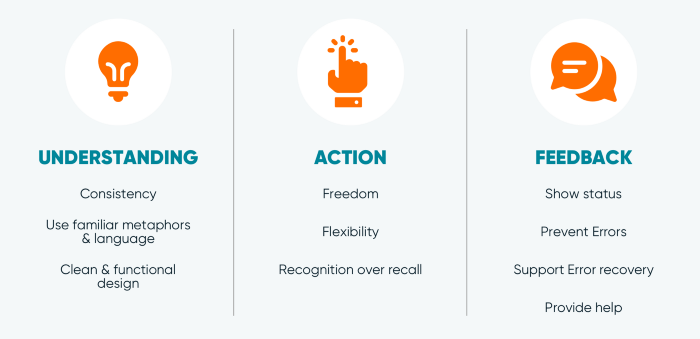
1. Visibility of system status
The system should always keep users informed about what is going on, through appropriate feedback within a reasonable time.
2. Match between system and the real world
The system should speak the users’ language, with words, phrases, and concepts familiar to the user, rather than system-oriented terms. Follow real-world conventions, making information appear in a natural and logical order.
3. User control and freedom
Users often choose system functions by mistake and will need a clearly marked “emergency exit” to leave the unwanted state without having to go through an extended dialogue. Support undo and redo.
4. Consistency and standards
Users should not have to wonder whether different words, situations, or actions mean the same thing.
5. Error prevention
Even better than good error messages is a careful design which prevents a problem from occurring in the first place. Either eliminate error-prone conditions or check for them and present users with a confirmation option before they commit to the action.
6. Recognition rather than recall
Minimize the user’s memory load by making objects, actions, and options visible. The user should not have to remember information from one part of the dialogue to another. Instructions for use of the system should be visible or easily retrievable whenever appropriate.
7. Flexibility and efficiency of use
Accelerators — unseen by the novice user — may often speed up the interaction for the expert user such that the system can cater to both inexperienced and experienced users. Allow users to tailor frequent actions.
8. Aesthetic and minimalist design
Dialogues should not contain information which is irrelevant or rarely needed. Every extra unit of information in a dialogue competes with the relevant units of information and diminishes their relative visibility.
9. Help users recognize, diagnose, and recover from errors
Error messages should be expressed in plain language (no codes), precisely indicate the problem, and constructively suggest a solution.
10. Help and documentation
Even though it is better if the system can be used without documentation, it may be necessary to provide help and documentation. Any such information should be easy to search, focused on the user’s task, list concrete steps to be carried out, and not be too large.
Ok, when is the best time to do it?
You can run a heuristic evaluation at any stage of the design process. If you are working on a new product, it’s best to perform it when the design phase is advanced — after wireframing and prototyping and before visual design and UI development begins.
Do it before the user testing session, to catch the first and most obvious problems on the way. This will help to avoid to bring them to the expensive and arduous user testing sessions.
As with any other usability testing method, if you decide to do it later, making changes for improvement will become more expensive. A very common case is that a team decides to make the heuristic analysis before starting with the redesign of a live product. Of course, they find out that they were having poor usability in their product for a long time.
How to Conduct a Heuristic Evaluation?
As we mentioned before, we need a group of experts for conducting a Heuristic Evaluation.
These people are usually usability testing experts that are familiar with the set of heuristics selected. The ideal situation would be that the evaluation can be conducted by a group formed by 5–8 people.
I know, it sounds like A LOT.
But why this number of experts?
Nielsen Norman says that “the benefit of having multiple reviewers is that although they will likely catch many of the same errors, they each will likely find some the others have missed”. This number of people will be able to identify at least 80% of the usability issues on the system. They also recommend having a person who is familiar with the product available (an “Observer”). This person will act as a recorder of the evaluation, taking notes of the issues the evaluators may find and having the chance to clarify the questions that may arise during the evaluation. This will help with the efficiency of the review.
As we’ve mentioned before, we need to define the scope of this evaluation creating a set of tasks. Those tasks are related to a crucial part of the product, specific user flow or feature, that will need to focus on.
Like with another user-centered design process we need to be sure before the start, that the evaluators understand the context of our product (business needs, market, competitors), who the user is and what are its needs.
The more we define the user persona the more accurate the heuristic evaluation results will be. We know that heuristics are understood as universal usability standards, but we need to point if there are some special needs that our users may have, like accessibility for elders, or if our product will be used by multicultural audiences.
Once the list of tasks is ready, they can observe how a participant performs those tasks or they can perform the tasks themselves.
During the evaluation, the experts will identify the usability issues and score the severity of each one of them. The severity of a usability problem is a combination of three factors:
- The frequency: common or rare?
- The impact: Easy or difficult to overcome?
- The persistence: Is it a one-time problem or a repeated one?

The rating of each problem will vary according to your market needs. Nielsen suggests that the rating must be condensed between all the experts participating in the evaluation (since opinions may be different about the same issue). Nielsen uses this scale:
0 = I don’t agree that this is a usability problem at all
1 = Cosmetic problem only: need not be fixed unless extra time is available on the project
2 = Minor usability problem: fixing this should be given low priority
3 = Major usability problem: important to fix, so should be given high priority
4 = Usability catastrophe: imperative to fix this before the product can be released
For further information about Severity, you can check Severity Ratings for Usability Problems
As it’s expected like with other usability testing tools, the deliverable for this evaluation consists of a consolidated report of the usability issues found by the experts, ranked by severity.
Notes and recommendations need to be specific and identify in a clear way the heuristic that the issue violates. We recommend also to always include screenshots of the product with notes since that will make easier for everyone to identify what part of the flow are we talking about.
The good news is that most of the usability problems found on this kind of analysis have obvious fixes and don’t require a brainstorming to find an innovative solution for them. Once they are noticed, the team can prioritize them on the backlog and start working on solving them.
“For usability testing to be valuable, study findings must clearly identify issues and help the team move toward design solutions.” — The Nielsen Norman Group
Wrapping up
We already know that a Heuristic Evaluation will help us discover many common usability problems. These findings will provide the team with a clear direction for iterate on the product. And that will significantly improve the product’s UX.
It’s relatively cheap and faster than other research methods. But be sure it is not the only source of information since it must be used along with user testing.
Educate your team about heuristics to always design with them in mind. Test early and often, and you will succeed in having a product that your users will love.